When designing an interface between man and computer, you will undoubtedly have to communicate certain state changes to users. Here, it is important to pay attention to the kind of change you want to communicate; failing to do so may harm user experience. Changes will have differing degrees of importance and urgency. Different levels of notification are appropriate for these (Pousman & Stasko, 2006). From low to high, these are:
- Inattention
- User Poll
- Change blind
- Divided Attention
- Make aware
- Focused Attention:
- Interrupt
- Demand action
User Poll
This is the lowest level of notification. The user must explicitly ask for an update. If some information is needed only in special circumstances, it shouldn't be visible all the time. If you have a problem with your computer, you may invoke the task manager. Only then you may see the changes in resource usage.
Change Blind
In this case the user also needs an to act to see a change, but the change was always in their field of perception. Take an analog clock, for example. While it is in our field of view, we do not see the hands change position. Yet when we focus our vision, we may see that the time has changed. It is very similar to "user poll", but the changing element always takes a place in our surroundings: it is not hidden. Subsequently, the effort to perceive the change is less than the aforementioned level.
Make Aware
This is the first level of attention where users notice a change. Here it is not required to focus on the changing element. At this level, users are able to split their attention between the informing object and other tasks. This is used a lot in ambient information systems (information embedded in the surroundings of its users, through use of auditory and visual stimuli). An example is of this is the Ambient Orb. It displays a custom data entry number as a color. Users don't have to direct their attention to the device to to notice a change. They can see it in their peripheral view.

Interrupt
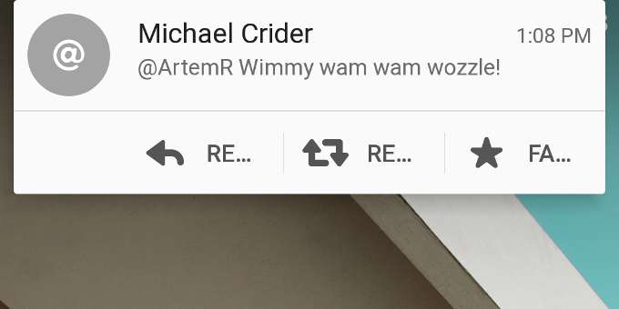
Here, users are forcibly asked to pay attention. An example of this is the notification peek feature of Android. Whenever a new message comes in, users are able to see (part of) its contents through a notification appearing at the top of the phone screen. They are interrupted from their current task as their attention is grabbed by the notification. After a few moments the notification disappears.

Demand Action
This is the highest level of notification, only reserved for events that demand the user to take a certain action at the very moment the event or change occurs. In essence, these are alarms. Examples are:
- Alarm clock: to wake you up in the morning
- Pharmacy fridge: In case of power loss, an optical and acoustical alarm is triggered. In addition, SMS messages or calls are automatically sent to the user.
Other thoughts
When I was laying in bed last night, my phone kept vibrating with an interval of around ten seconds. After a few buzzes, I grew slightly annoyed, as it was keeping me from falling asleep. Who was contacting me this late at this time? I picked it up, slid down the notification area expecting some new message, but nothing was there. It turned out my phone was installing updates. Each time an update stated downloading, and each time one had finished installing, a new notification was created. This was standard behavior for my Xiaomi device (I cannot imagine Google implemented it in this way). I suppose it was just an oversight. This notification should have been change blind or possibly polled by the user.
So, take into account these possible notification levels and use common sense to select the one that is right for your context. I would argue to keep it as low if possible, to not annoy your users.
References
- Pousman, Z., & Stasko, J. (2006). A taxonomy of ambient information systems. Proceedings of the Working Conference on Advanced Visual Interfaces - AVI ’06. https://doi.org/10.1145/1133265.1133277
- Matthews, T., Dey, A. K., Mankoff, J., Carter, S., & Rattenbury, T. (2004). A toolkit for managing user attention in peripheral displays. Proceedings of the 17th Annual ACM Symposium on User Interface Software and Technology - UIST ’04. https://doi.org/10.1145/1029632.1029676
- Home. (n.d.). Retrieved September 12, 2019, from http://www.ambientdevices.com/