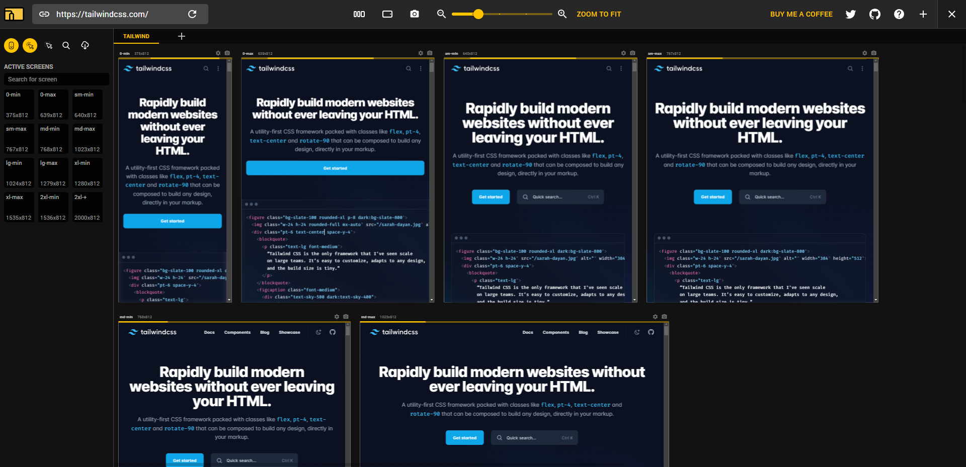
In order to make a website look good on any screen, it is useful to have some sort of way to consistently test the website on different screen sizes. It is particularly useful to test at the breakpoints which are used in the CSS to apply different css rules.
The Responsive Viewer browser extension can be used to check multiple screen sizes at once. It comes with a preset of screen sizes related to common devices. However, if you want to test at breakpoints which are used in the CSS, you have create your own screens.
For Tailwind, a set of default breakpoints is defined. For each breakpoint, you may create 2 screens: one for the minimum width and one for the maximum width. The minimum width screen should have the same width as the breakpoint, and the maximum width screen should have the same width as the next breakpoint minus 1 pixel. This will result in such a set of screens:

Below is a JSON file which can be imported into the Responsive Viewer browser containing only the screens for the Tailwind breakpoints.
{
  "screens": [
    {
      "height": 812,
      "id": "8cefd703-7ae5-464e-8c3f-0d8171230c6e",
      "name": "0-min",
      "userAgent": "Google Chrome",
      "visible": true,
      "width": 375
    },
    {
      "height": 812,
      "highlighted": false,
      "id": "09cd1782-de21-4d14-ae5a-91d741784f30",
      "name": "sm-min",
      "userAgent": "Google Chrome",
      "visible": true,
      "width": "640"
    },
    {
      "height": 812,
      "highlighted": false,
      "id": "565670bb-83da-48c6-a7d9-b9d4037e727c",
      "name": "0-max",
      "userAgent": "Google Chrome",
      "visible": true,
      "width": "639"
    },
    {
      "height": 812,
      "id": "bdf94f06-29d0-457b-9836-9397c552a292",
      "name": "sm-max",
      "userAgent": "Google Chrome",
      "visible": true,
      "width": "767"
    },
    {
      "height": 812,
      "id": "d54026b5-d882-409b-9f7c-e5d6b138abce",
      "name": "md-min",
      "userAgent": "Google Chrome",
      "visible": true,
      "width": "768"
    },
    {
      "height": 812,
      "id": "3ed5aebb-ebc9-4ab0-8459-d2a91f34271e",
      "name": "md-max",
      "userAgent": "Google Chrome",
      "visible": true,
      "width": "1023"
    },
    {
      "height": 812,
      "id": "65615222-53da-4929-9fe1-19fd2daba680",
      "name": "lg-min",
      "userAgent": "Google Chrome",
      "visible": true,
      "width": "1024"
    },
    {
      "height": 812,
      "id": "0769ab0e-3881-4000-a755-b2a95446e524",
      "name": "lg-max",
      "userAgent": "Google Chrome",
      "visible": true,
      "width": "1279"
    },
    {
      "height": 812,
      "id": "f6d1c51a-9eb6-47c1-a59f-888660b8b2b5",
      "name": "xl-min",
      "userAgent": "Google Chrome",
      "visible": true,
      "width": "1280"
    },
    {
      "height": 812,
      "highlighted": false,
      "id": "07eb7581-219b-42ee-bb70-e41f5e82e35a",
      "name": "xl-max",
      "userAgent": "Google Chrome",
      "visible": true,
      "width": "1535"
    },
    {
      "height": 812,
      "id": "c755868a-a100-48d3-9246-1aeef44a1dac",
      "name": "2xl-min",
      "userAgent": "Google Chrome",
      "visible": true,
      "width": "1536"
    },
    {
      "height": 812,
      "id": "a34406ef-7254-42c6-851b-f716817effcf",
      "name": "2xl-+",
      "userAgent": "Google Chrome",
      "visible": true,
      "width": "2000"
    }
  ],
  "userAgents": [
    {
      "name": "Google Chrome",
      "value": "Mozilla/5.0 (Macintosh; Intel Mac OS X 10_14_0) AppleWebKit/537.36 (KHTML, like Gecko) Chrome/75.0.3770.142 Safari/537.36"
    }
  ],
  "viewMode": "vertical",
  "zoom": 0.6,
  "screenDirection": "portrait",
  "syncScroll": true,
  "syncClick": true,
  "tab": "tailwind",
  "tabs": [
    {
      "name": "tailwind",
      "screens": [
        "8cefd703-7ae5-464e-8c3f-0d8171230c6e",
        "565670bb-83da-48c6-a7d9-b9d4037e727c",
        "09cd1782-de21-4d14-ae5a-91d741784f30",
        "bdf94f06-29d0-457b-9836-9397c552a292",
        "d54026b5-d882-409b-9f7c-e5d6b138abce",
        "3ed5aebb-ebc9-4ab0-8459-d2a91f34271e",
        "65615222-53da-4929-9fe1-19fd2daba680",
        "0769ab0e-3881-4000-a755-b2a95446e524",
        "f6d1c51a-9eb6-47c1-a59f-888660b8b2b5",
        "07eb7581-219b-42ee-bb70-e41f5e82e35a",
        "c755868a-a100-48d3-9246-1aeef44a1dac",
        "a34406ef-7254-42c6-851b-f716817effcf"
      ]
    }
  ],
  "singleView": true
}